Piyi Dinaki
When the soft drinks’ company “Florina Dinaki” aprroached us in order to undertake its branding strategy the goal was one and clear: total upgrade of the brand and its products in order to reach a higher positioning image level.
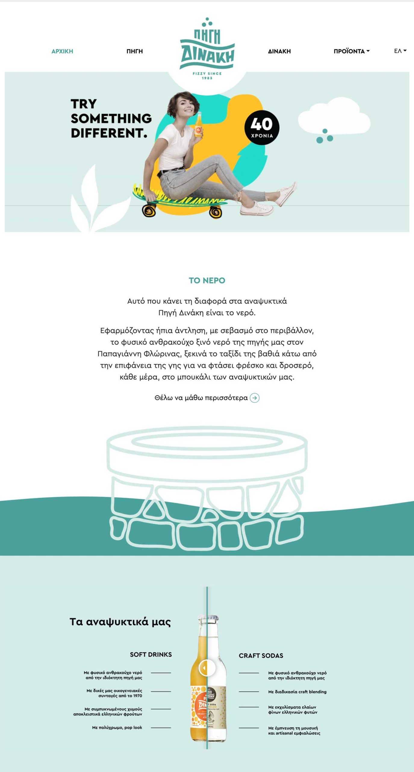
Keeping in mind our rule of enhancing the competitive advantage of each brand we work with, we changed its name, gave it a new identity and offered to it features with long lasting power.
Brand Name
«Florina-Dinaki» became «Piyi Dinaki» [piyi means water spring in Greek], thus putting the privately owned water source of the company in the center of the attention. It is this natural fizzy water that gives to the Dinaki soft drinks their unique taste.
Logo
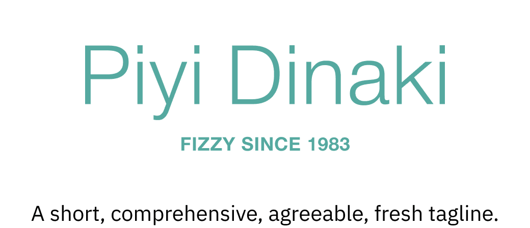
Particular color, fresh. Motion, bubbles and vintage elements.
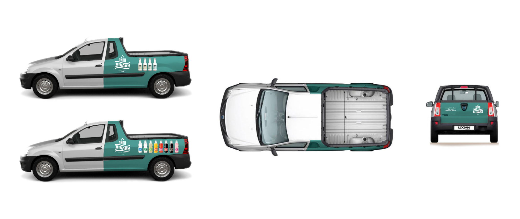
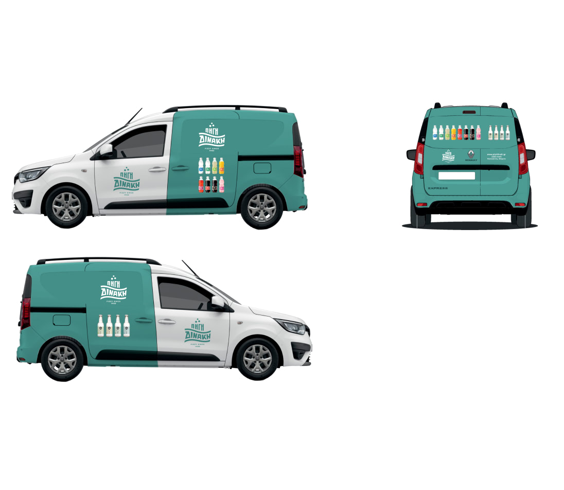
PACKAGING
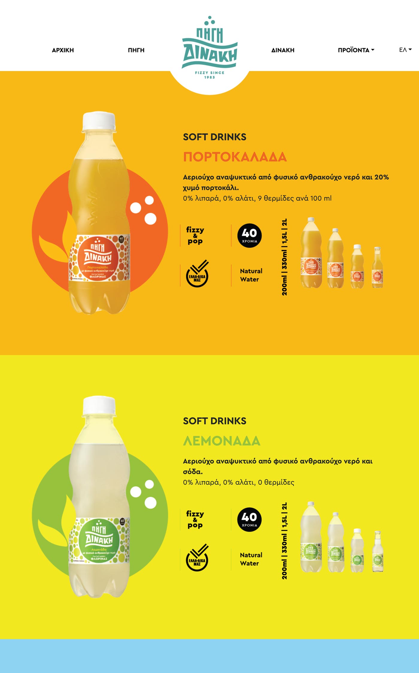
Pop look, intense colors and the bubbles of the natural sparkling water become the center of the visual identity.
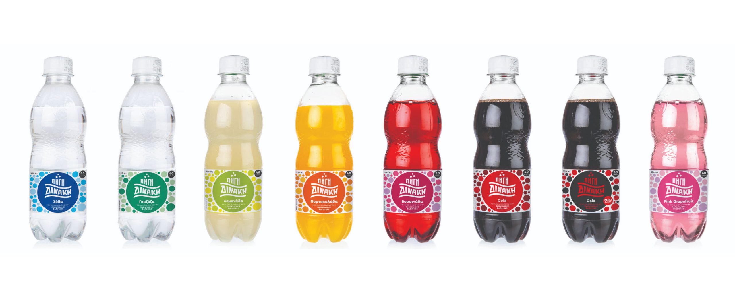
NEW SERIES
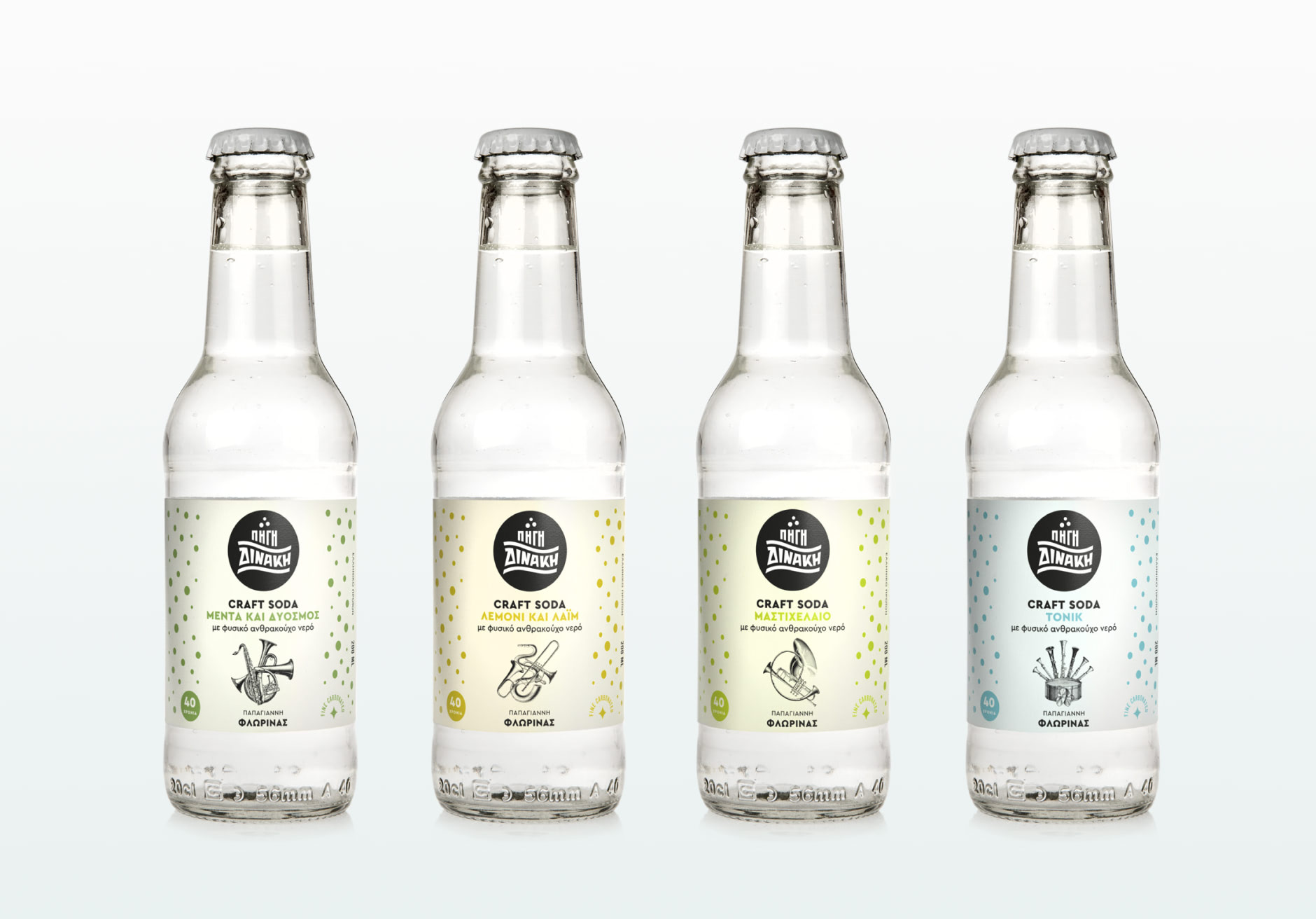
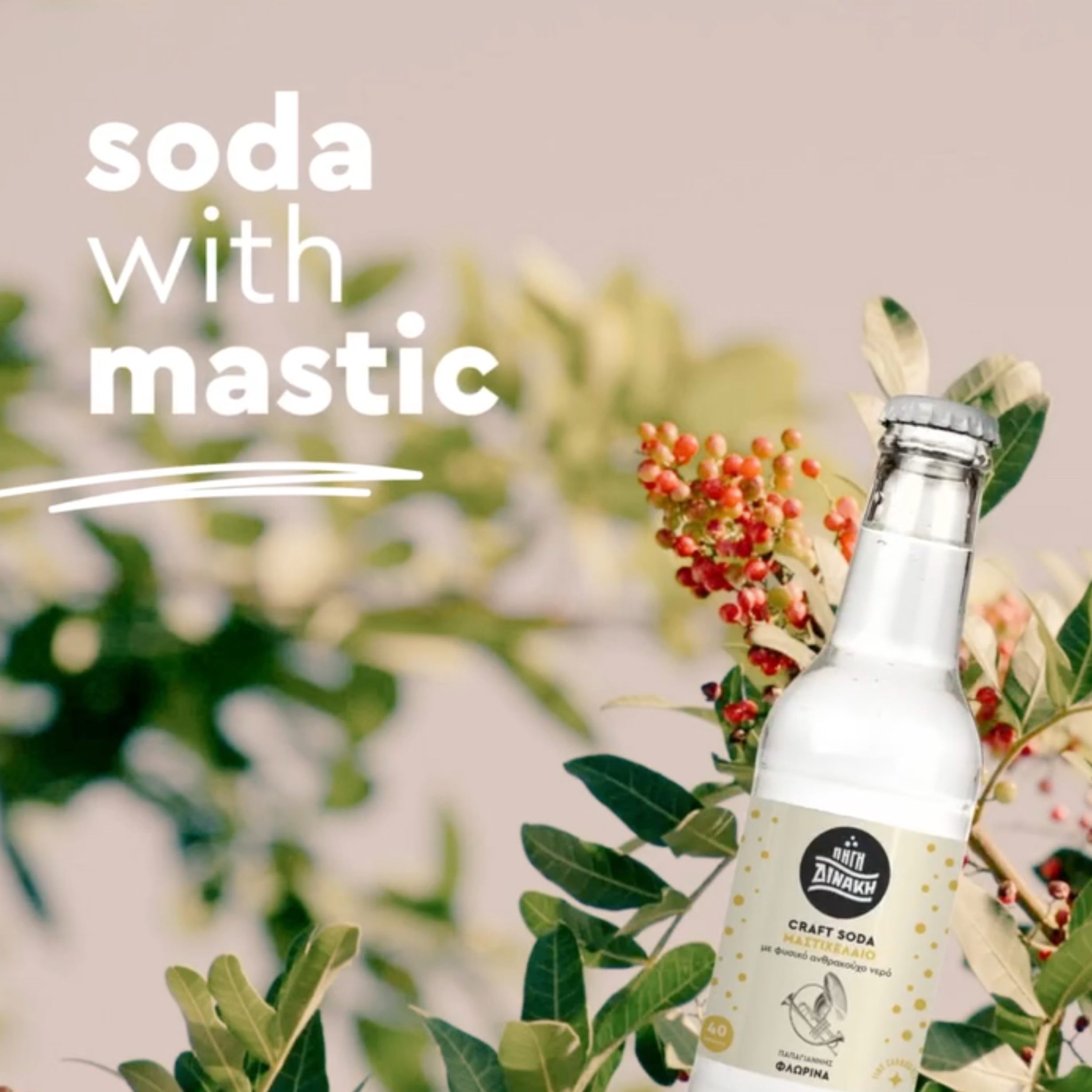
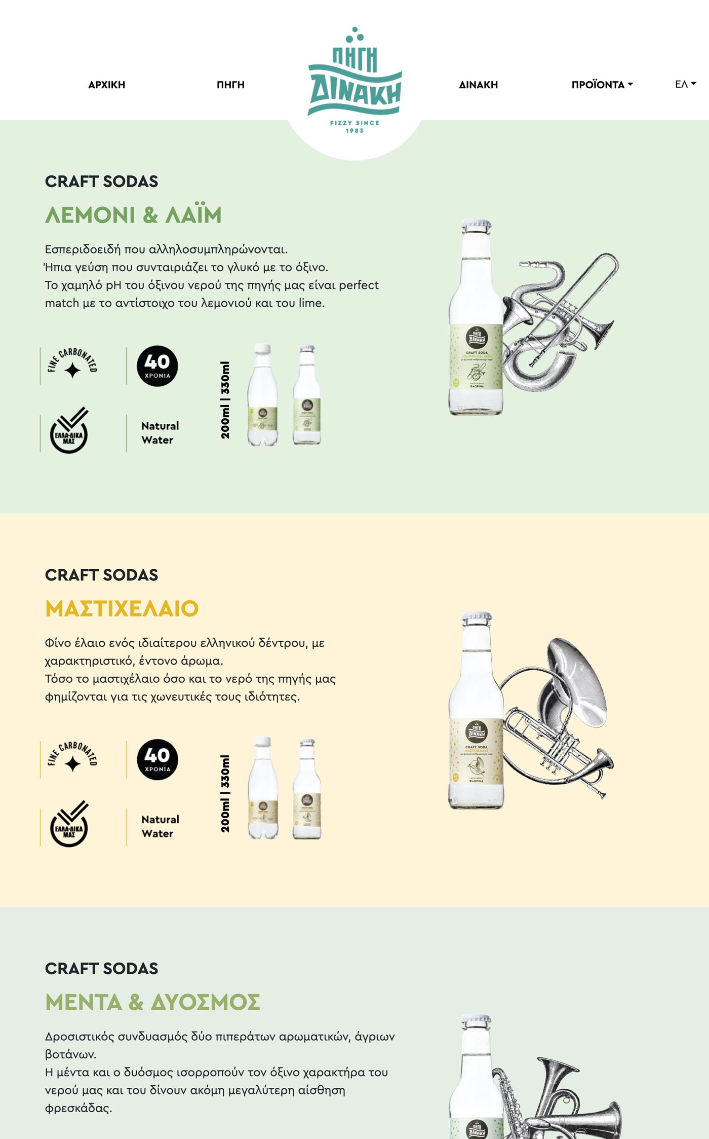
The portfolio strategy is completed with a new series of soft drinks under the umbrella-philosophy CRAFT SODAS, which is used for the first time on soft drinks labels.
The Piyi Dinaki “sour” water is combined with flavors that rock.
Campaign
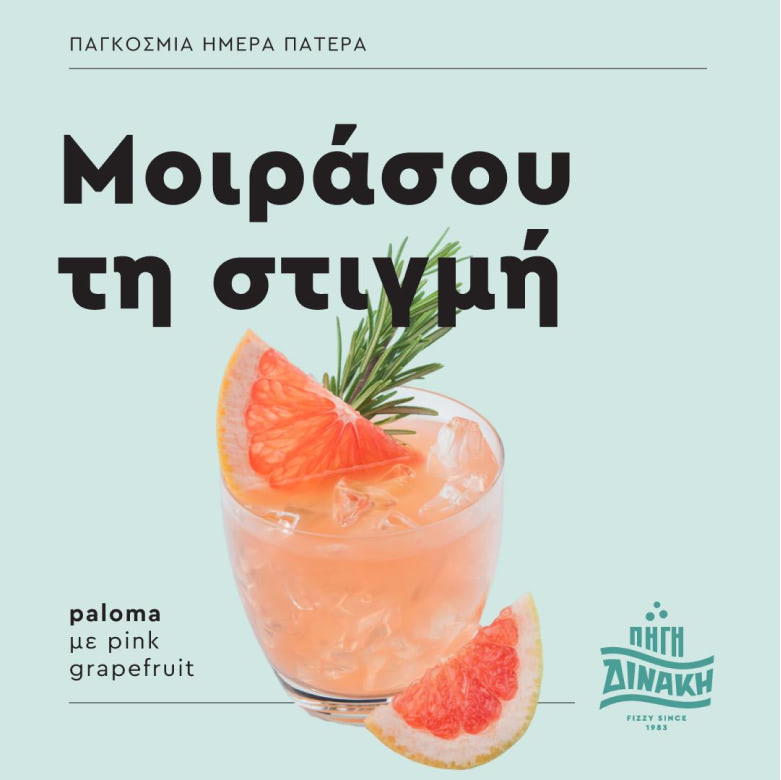
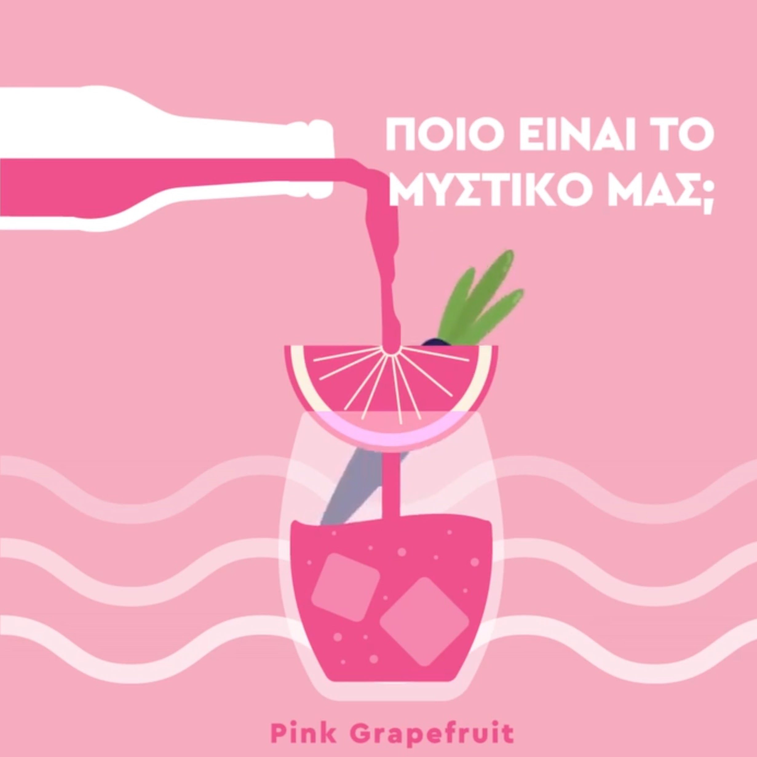
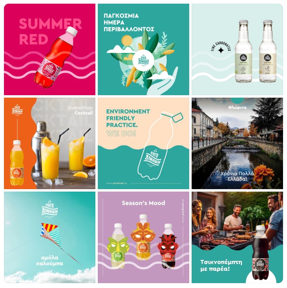
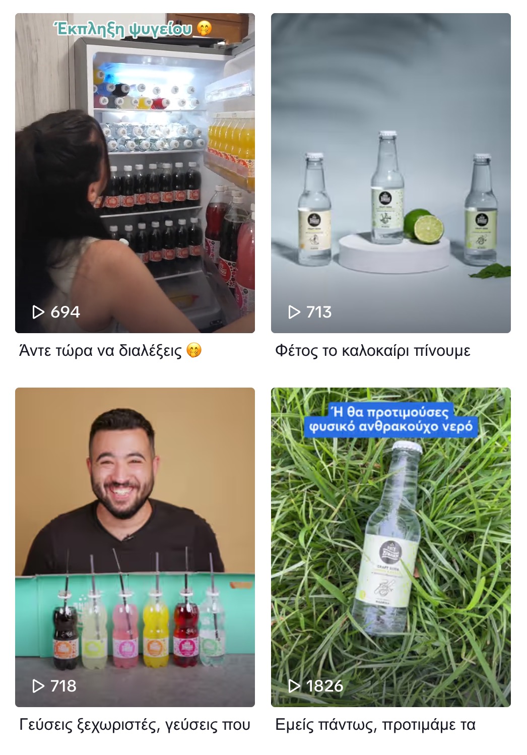
The social media campaign introduces the new identity to the public and Piyi Dinaki soft drinks are gaining their first fanatic friends.

Cooperations
Red Creative

